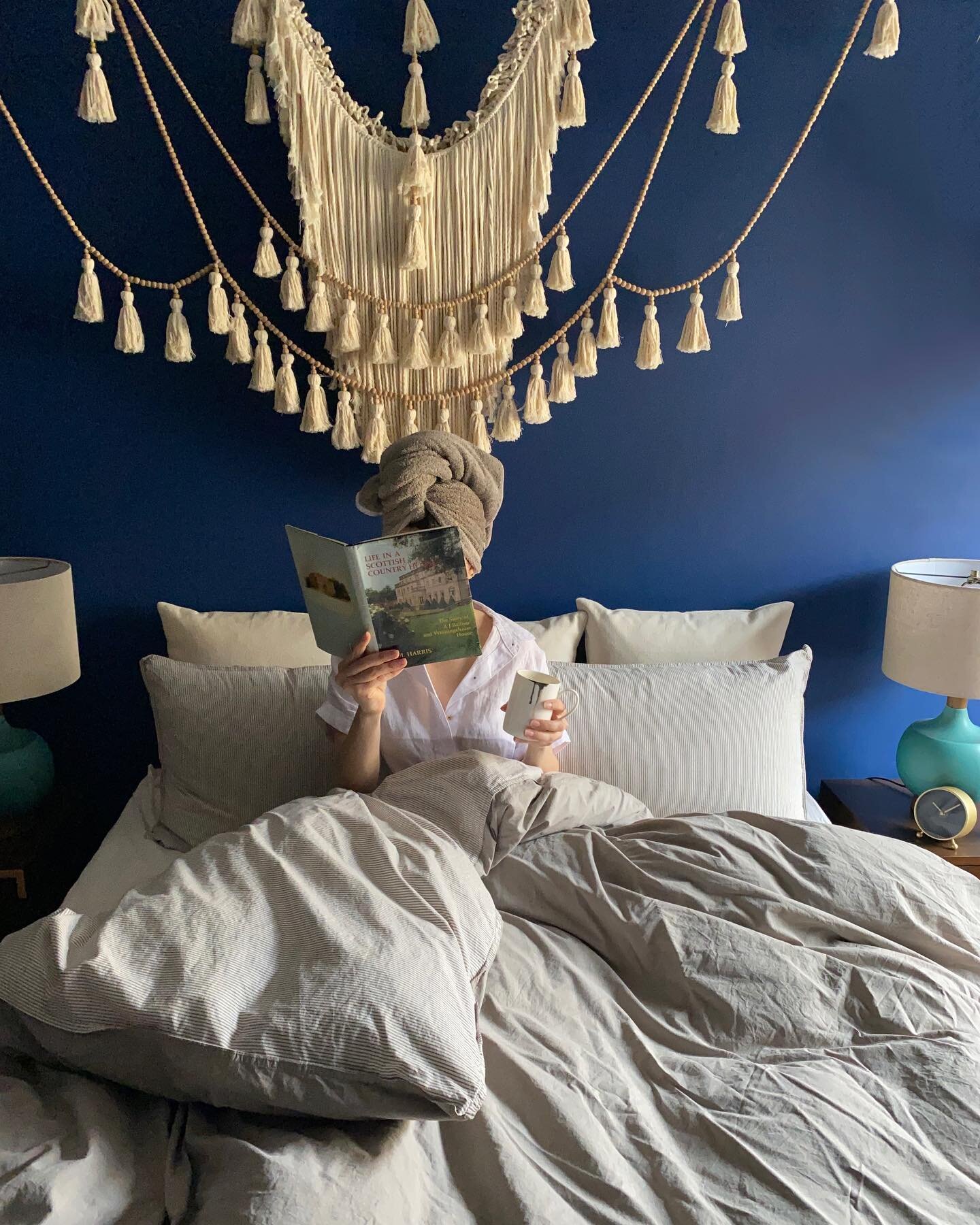
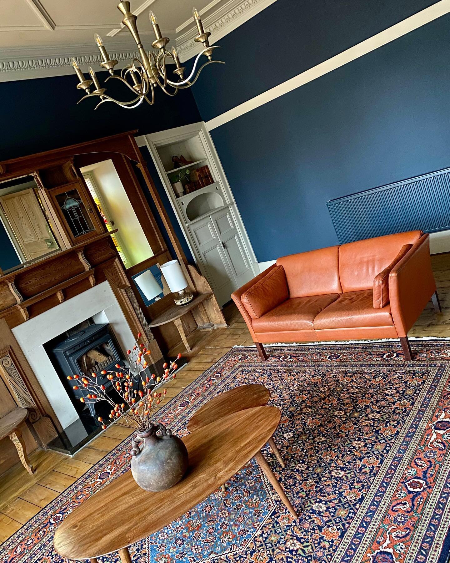
Before, there were no defined spaces. So, the plan was to create a specific purpose for each room, utilising the space as efficiently as possible. Although the apartment is small, it has all the essentials for modern living. This was the concept for the whole design. I kept the décor consistent throughout the flat. Blues and yellows with a mid-century modern vibe.
Read MoreWhen Graeme and I decided to move in together we vowed not to buy the first place we viewed, but lo and behold, it happened! As soon as we walked through the door, we fell in love with the place. The purple kitchen, grim bathroom and the smell of dampness didn’t put us off. The apartment hadn’t been lived in for over a year and the renovation seemed never-ending but we eventually created a home that we can still enjoy to this day.
Read MoreWe have three bedrooms in our apartment. The blue room is the spare bedroom, the green room is the Airbnb room and the Master is our bedroom. The Master bedroom mirrors the living room so it’s huge! It houses our bed, as well as a wardrobe, fireplace, my workspace and Graeme’s music studio. We opened our home to short term lets about a year ago. We always stay with locals in their home when we go travelling so we thought why not!
Read MoreI tend to tackle bathroom decor with a single starting point, such as a tile I love or a particular bath, and then work the rest based on that. I knew I wanted ‘concrete’ walls so that was the starting point for me here. There is a partition in the bathroom that separates the bath and toilet from the vanity area. It doesn’t reach the ceiling and it has a door with some stained glass panels in it. It’s a beautiful original feature that has green tones in it, so I added green touches throughout to compliment that.
Read More


